I was given assignment 'Stop Motion in TV' by my tutor.
I chose the room at my boarding school because it is a modern room and had alot of space to film in. E4 appeals to a young audience who love going out, sleepovers, being sociable and spending their time on heavy internet use like Facebook or YouTube.
This room style will look like the early digital era. The couch will change colour randomly. The stop motion (Logo of E4) objects will fly out of the smart phones, laptops, computer, iPad tablet and window. The background will change into light purple.
I will use the After Effect’s tool called Flare Light to make the ident look more like it is in the digital era.
The camera movement will be done by using the dolly in each scene.
After Effect for changing the objects’ colour into purple. Use the Animation tool to make the objects moving. Photoshop to create the logo of E4.
Sony Vegas Pro for editing the clips.
3D Camera tracker (After Effect tool) (Matchmoving) can scan every the camera movement and then to create the tracker’s map for After Effect.
 To gather my research I created a questionnaire using Survey Monkey and the responses from my class.and outsiders.
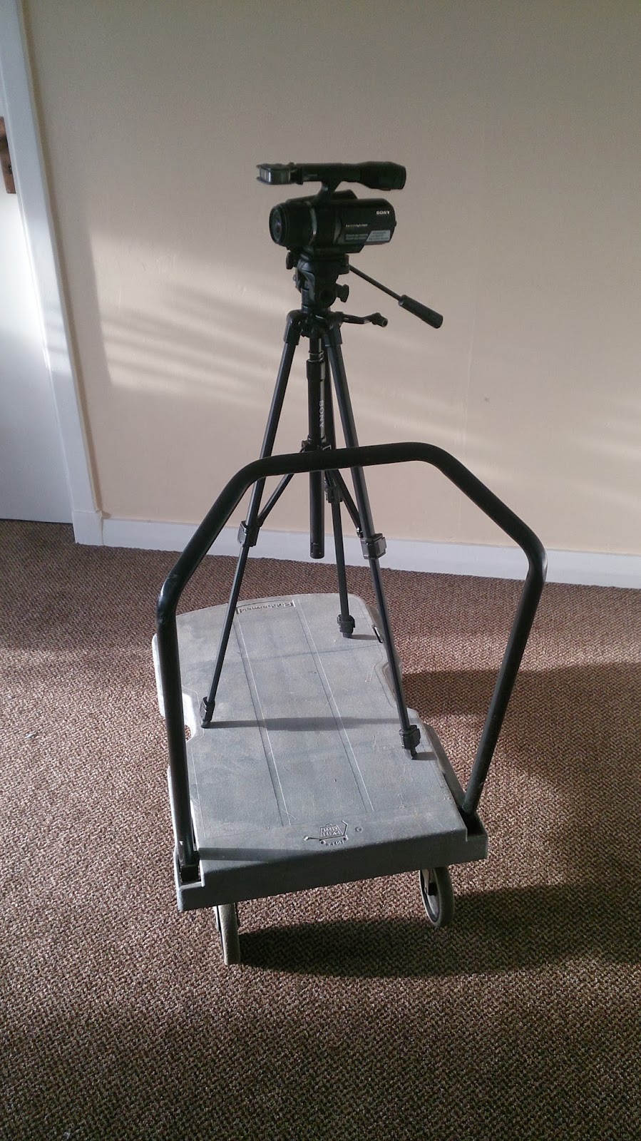
This is homemade dolly.
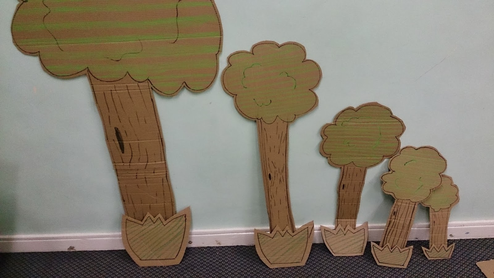
I used the cutting board, the knife and black pen to make the cardboard animation.
Some of them were colours by using the oild pastels.I cut them out by each frames.

This is brainstorming map which can help me to get idea.
After creating the brainstorming, I got an idea to create the shark.
I made the shark jump and eat the E4 logo. I thought it would be entertaining for the young and also the older viewers would find them amusing. Feedback
The feedback from the class was very positive. On the whole, they thought that the technical part of the ident was professional and good quality. One commented that the animation was "smooth and jerky" but that it made a good effect also, I had two positive comments about the lighting effects on the TV and phone.
For the soundtrack the responses were positive and professional.
The comment about the creativity of the ident were, "smooth animation using a range of skills". Also, "a good use of the iconic E4 purple"
However, I had some comments that I did not really use Stop Motion. I agree, I did create the animations digitally but feel that I agree with some of comments. However, I did not agree with the comment about the work being digital because I asked the tutor beforehand and it was agreed that I could use digitally stop motion format.
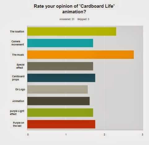
From the Survey Monkey I had 24 responses; 60% were female and 40% were male. The age range was between 18 years and 64 years old.
Figure 1
"It is lively and contemporary is style. The cardboard shapes suggest a variety of programmes. The whimsical nature of the animations is interesting, and intriguing." and "It tells me of something that I'm trying to find out, I assume it's do with children in adventure!" I think they were very close what my target. Next time, I would research about real E4 ident bit more. And then remodel the cardboard to make them appeal to the older audience.
Figure 2
This asked the suitability of the music to suit the animation and the E4 audience type. It was felt that it was 'cheesy' and did not have enough 'upbeats' to the track. i agree with this because I realise that the music was not suitable for a younger audience. It was the older age group who thought it was not suitable. However, the Ident is aimed at the younger audience who did not have any negative comments.

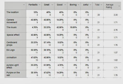
Figure 3
Some people think the music is good (42%) however, some of them think it is boring (19%). this could link with the comments about it being too 'cheesy' and needing to be more 'upbeat'. The track could be more up to date and modern. I could have researched popular music which young people listen to.the E4 logo received over 50% 'Fantasic' comments. I am pleased with the final production of it but I would improve the SFX like the comment said "Just as an example; when your rocket flies across the screen at about 0.13, you could add a shadow to the wall to add some more realism to the animations. Think of how the light would cast the shadow in the room if it was really there." I will research about shadow, on the small stage with lighting. i could also take some photos of objects to study the shadow positions
I think this is good advice for the next time I do stop motion work.
"This is for most filmmakers one of the golden rules. Instead of zooming in, track forward. Going on your tracks sideways you've either got a dolly or a very steady hand (if its the steady hand lucky you!), both will have better effect than a zoom in this case."
Next time I will improve the camera dolly, remodeling the cardboard and pick the better location which have big space for the camera to film. I would change the props to look more modern, when I find the modern props then I will relocate it into the living room.


No comments:
Post a Comment