Friday, 24 January 2014

Unit 35 Research

Unit 35 Research
Artists first experimented with video art in the 1960s when video art first appeared. Video art relies on video and/ or sound to make new medium. In the 1990s, digital technology joined together with the video process, independent film-making and photography.

Nam June Paik is thought to be the founder of video art. He had his first exhibition with manipulated TV in 1963 at the Gallery Parnass in Wuppertal.


Over time, Nam June Paik worked with the Neo-Dada art movement, known as Fluxus, the artists were inspired by the composer John Cage who used everyday sounds and noises in his music. He showed his work at an exhibition known as Exposition of Music-Electronic Television where he scattered televisions everywhere and used magnets to alter or distort their images.
Paik was known for making robots out of television sets. These were made using pieces of wire and metal, but later Paik used parts from radio and television sets.
Nam June Paik, 'Robot K-456' and Charlotte Moorman (1964). Photo by Peter Moore @ Estate of Peter Moore/VAGA.NY
Nam June Paik, 'Robot K-456' and Charlotte Moorman (1964).
http://www.paikstudios.com/#top

Electronic Superhighway: Continental U.S., Alaska, Hawaii
fifty-one channel video installation (including one closed-circuit television feed), custom electronics, neon lighting, steel and wood; color, soundapprox. 15 x 40 x 4 ft.Paik siad that, 'The different colors remind us that individual states still have distinct identities and cultures, even in today's information age." He meant that each American state had its own history, values and diversity so he shows this with the individual shapes and colours.

Megatron/Matrix: here he created aneight-channel video installation with custom electronics; color, soundapprox. 132 x 396 x 48 in. (335.3 x 1005.8 x 121.9 cm)Paik said, '... our bodies are our primal connection to the world, but the effect on the viewer is of being assaulted by "too much information.' The 215 TV screens show different mixes images from the Seoul Olympics with Korean folk rituals and modern dance. Smaller clips play at the same time on multiple monitors, while larger, animated images flow across the boundaries between screens, suggesting a world without borders in the electronic age.


A modern video artist I am interested in is Michael Betancourt. He is a critical theorist, film theorist, art and film historian, and animator. He looks at the technologies of visual music, new media art and theory, and motion pictures.
 He has used old film footage with modern footage to create his video artwork.
http://av.vimeo.com/34521/441/136531114.mp4?token2=1390386989_e6abe2f72d9285a9905ae914e1cd3ea1&aksessionid=05c94bb07336b29f&ns=4


she, my memory (2002)

Michael Betancourt made this in 2002, he used his editing software to render high quality footage into very low quality footage. He used small footage because low quality footage are 240p resolution. If he made them extend to fit in 4:6 screen then there will huge pixel with a blur.  

David Finkelstein, 'Film Threat' said '... an image of the woman he is seeking is caught and frozen within the rushing motion, and gradually blown up until the pixelization of the image makes it unrecognizable. This film uses a spare and powerful visual language to depict the unease that our memories can cause us..." about she, my memory.'


File:Kodak Moment (2013) sample animation.gif


The Kodak Moment (2013)

https://vimeo.com/73802758: Michael Betancourt
The silent film actress Mae Murray, known as the “girl with bee-stung lips,” is shown in fancy dress, flirting with the audience. She is an early 20th Century Hollywood film star with her white face and red lips, a form that was already old when the source film was shot in 1922.  Here Betancourt has glitched and fragmented her movement. but she is still recognizable throughout this movie. The music is from an old 1920 recording of piano soloist Mary Hallock-Greenewalt playing Chopin’s Nocturne in G Major.
Glitch is used to describe these kinds of bugs as they happen in software, video games, images, videos, audio, and other forms of data. 


Contact Light (2012)

Michael Betancourt


Contact Light explores the idea of the 'man in the moon' through glitches, optical illusions and the Apollo 11 and 17 missions in 1969 and 1972, designed by Michael Betancourt.

In Georges Melies' 1902 film "A Trip to the Moon," the astronomers are dressed as wizards, not scientists, putting the journey they make into fantasy-- seventy years later humans actually go to the moon.. It is possible to have seen Melies' film when it was new and to watched the 1969 moon landing as an adult. He has linked them together to make a juxtaposition of  old fantasy ideas of the moon and visiting it in reality that gave rise to this film.

The Process of Eupraxis in Making Dancing Glitch (2013):
http://www.othercinema.com/otherzine/the-process-of-eupraxis-in-making-dancing-glitch-2013/
Dancing Glitch is a 2.5 minute long movie that is based around footage from the Louis Lumière film Danse serpentine, vue no. 67, then dancer/choreographer is Loïe Fuller, filmed in 1896. Betancourt liked early 20th Century artwork. The clip was hand coloured and the colour was animated. He compressed the digital file but kept some of the detail. Betancourt made this short film as the starting point for his exploration of how digital movies change to abstract art when experimenting with glitching to give extra layers to the result.


Jennifer Steinkamp
This artist is from Los Angeles, explores ideas about architectural space, motion using computer animation to engage viewers through use of transient elements in the natural world. Her work has been called ‘a darker view of nature thoroughly manipulated by man’. (Xandra Eden, University of North Carolina)


Our image this month is a still from a video, exhibited earlier this year at Greengrassi gallery London, which continues Jennifer Steinkamp says other artists who have influenced her are Turrell, Dutch painters, and Jackson Pollock. She begins planning each piece by visiting the site where it is going to be installed. She researches the context and history of the place and then creates a three-dimensional model to see how the projection will look. She describes the actual creation of the images as a combination of painting, sculpture and photography using computer paint programs and LED lights. This piece was made for the Hammer Gala 2007 honoring Mike Kelley, who was one of her favorite teachers. This piece is part of a series work in which she pays respect to her past teachers with trees dedicated to them.


this artist from Madrid calls himself SpY. he Installed the cameras with the “intention of not watching over anything,” SpY’s new intervention in Madrid features 150 fake surveillance cameras on the side of a building. The Spanish street artist is known for his appropriation of urban elements to make his message known and this newest Cameras piece is no exception.

Above artists were inspiration to me, they give me an idea: 'Spying' NSA , glitching and using light to create a pathway of exploration. SpY's ideas have influenced me to use CCTV cameras to film peoples' reactions to being watched. 
Friday, 17 January 2014

Stop Motion Ident Assignment evaluation

Evaluation for E4
I was given assignment 'Stop Motion in TV' by my tutor.

I chose the room at my boarding school because it is a modern room and had alot of space to film in.  E4 appeals to a young audience who love going out, sleepovers, being sociable and spending their time on heavy internet use like Facebook or YouTube. 
This room style will look like the early digital era. The couch will change colour randomly. The stop motion (Logo of E4) objects will fly out of the smart phones, laptops, computer, iPad tablet and window. The background will change into light purple. 
I will use the After Effect’s tool called Flare Light to make the ident look more like it is in the digital era. 

The camera movement will be done by using the dolly in each scene.
After Effect for changing the objects’ colour into purple. Use the Animation tool to make the objects moving. Photoshop to create the logo of E4. 
Sony Vegas Pro for editing the clips.
3D Camera tracker (After Effect tool)  (Matchmoving) can scan every the camera movement and then to create the tracker’s map for After Effect.

To gather my research I created a questionnaire using Survey Monkey and the responses from my class.and outsiders.


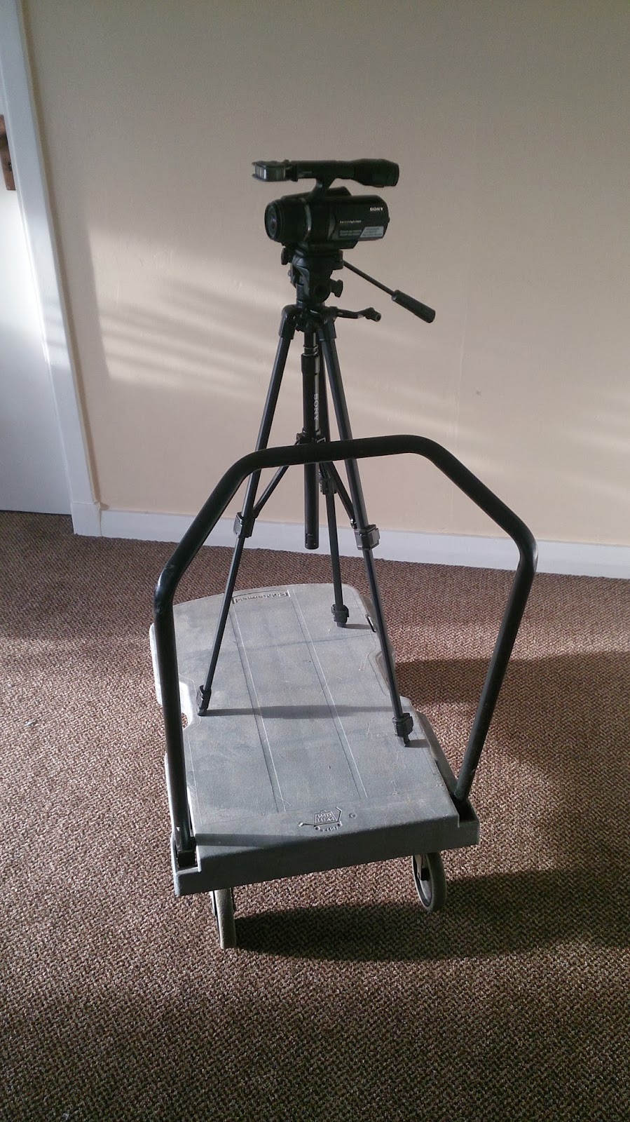
This is homemade dolly. 

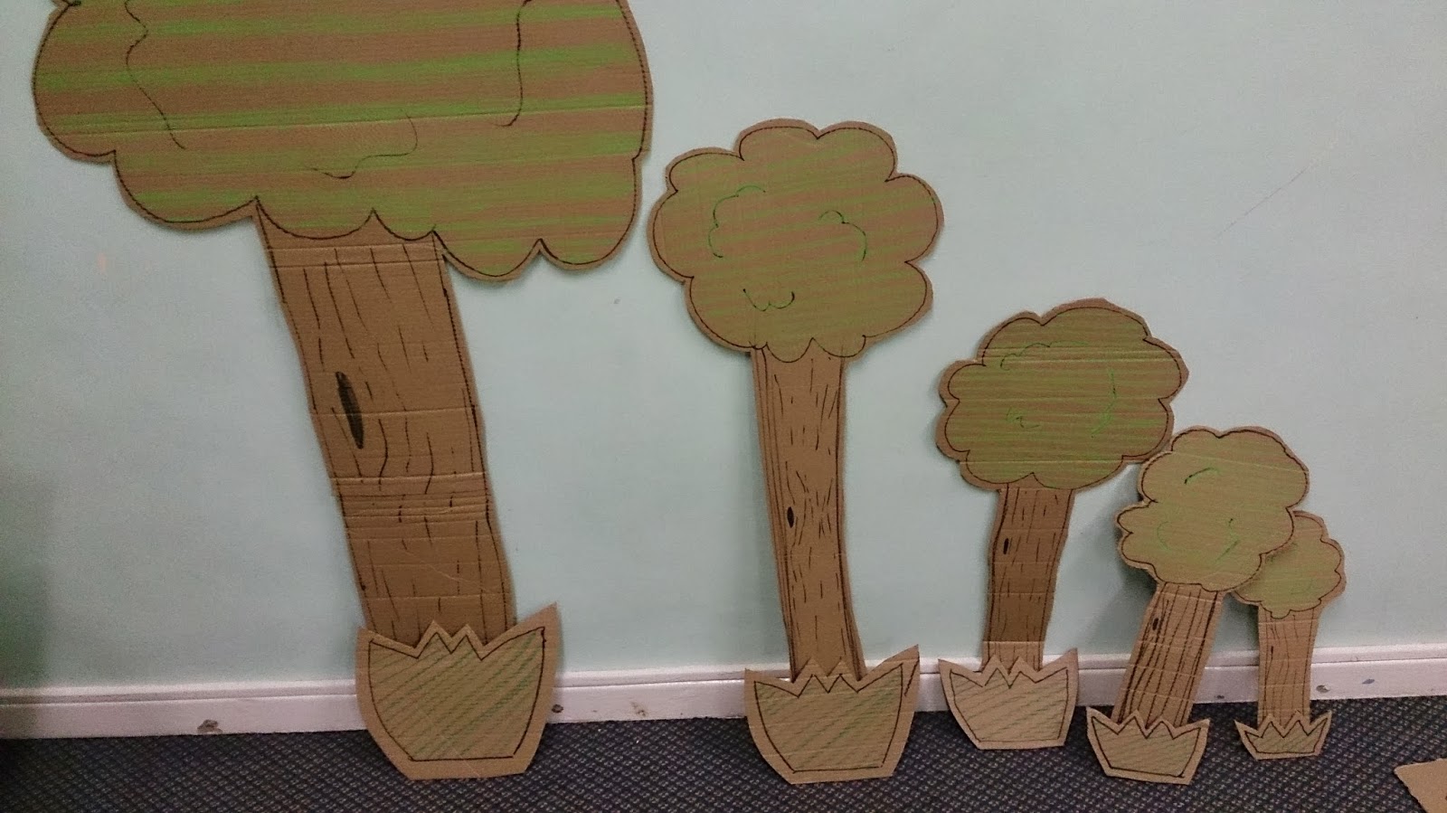
I used the cutting board, the knife and black pen to make the cardboard animation.
 Some of them were colours by using the oild pastels.
I cut them out by each frames.  
 
 This is brainstorming map which can help me to get idea.

After creating the brainstorming, I got an idea to create the shark.
I made the shark jump and eat the E4 logo. I thought it would be entertaining for the young and also the older viewers would find them amusing. 

Feedback
The feedback from the class was very positive. On the whole, they thought that the technical part of the ident was professional and good quality. One commented that the animation was "smooth and jerky" but that it made a good effect also, I had two positive comments about the lighting effects on the TV and phone. 

For the soundtrack the responses were positive and professional.

The comment about the creativity of the ident were, "smooth animation using a range of skills". Also, "a good use of the iconic E4 purple"

However, I had some comments that I did not really use Stop Motion.  I agree, I did create the animations digitally but feel that I agree with some of comments. However, I did not agree with the comment about the work being digital because I asked the tutor beforehand and it was agreed that I could use digitally stop motion format.

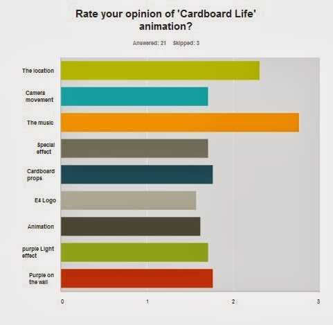
From the Survey Monkey I had 24 responses; 60% were female and 40% were male. The age range was between 18 years and 64 years old.


Figure 1
"It is lively and contemporary is style. The cardboard shapes suggest a variety of programmes. The whimsical nature of the animations is interesting, and intriguing." and "It tells me of something that I'm trying to find out, I assume it's do with children in adventure!" I think they were very close what my target. Next time, I would research about real E4 ident bit more. And then remodel the cardboard to make them appeal to the older audience. 

Figure 2
This asked the suitability of the music to suit the animation and the E4 audience type. It was felt that it was 'cheesy' and did not  have enough 'upbeats' to the track. i agree with this because I realise that the music was not suitable for a younger audience. It was the older age group who thought it was not suitable. However, the Ident is aimed at the younger audience who did not have any negative comments.


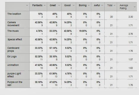
Figure 3 
Some people think the music is good (42%) however, some of them think it is boring (19%). this could link with the comments about it being too 'cheesy' and needing to be more 'upbeat'. The track could be more up to date and modern. I could have researched popular music which young people listen to.
the E4 logo received over 50% 'Fantasic' comments. I am pleased with the final production of it but I would improve the SFX like the comment said "Just as an example; when your rocket flies across the screen at about 0.13, you could add a shadow to the wall to add some more realism to the animations. Think of how the light would cast the shadow in the room if it was really there."  I will research about shadow, on the small stage with lighting. i could also take some photos of objects to study the shadow positions

I think this is good advice for the next time I do stop motion work.
"This is for most filmmakers one of the golden rules. Instead of zooming in, track forward. Going on your tracks sideways you've either got a dolly or a very steady hand (if its the steady hand lucky you!), both will have better effect than a zoom in this case."

Next time I will improve the camera dolly, remodeling the cardboard and pick the better location which have big space for the camera to film.  I would change the props to look more modern, when I find the modern props then I will relocate it into the living room. 


Unit 64 - Motion Graphics and Composting essay.

I'm researching about how the filmmakers used the Special Effect (Known as SFX)  I choose the film called 'Hugo' "Hugo is a 2011 3D historical adventure drama film based on Brian Selznick's novel The Invention of Hugo Cabret about a boy who lives alone in the Gare Montparnasse railway station in Paris."
This film won five Oscars 'Best Cinematography, Best Art Direction, Best Visual Effects, Best Sound Mixing, and Best Sound Editing'
Hugo is Scorsese's first film shot in 3D, of which the filmmaker said "I found 3D to be really interesting, because the actors were more upfront emotionally. Their slightest move, their slightest intention is picked up much more precisely." http://en.wikipedia.org/wiki/Hugo_(film)

I'm going to explain all of this photos with SFX methods.

At the start, I can tell that scene is full of CGI objects. My guess is about 10 to 20 3D artists to created each the objects for example, they can make everything like the dust to earth. The 3D artists chose the sky image as 2D object because they make the computer ram's free space for the 3D objects. When The 3D objects' colour did not match other colour then the 3D artists use 'curve tool'. It can adjust the colour to match with other the colour and to make them looked realist. You can find 'Curve tool' in After effect or other SFX maker software. This camera's flying movement was creating by the 3D software in the computer. It's impossible for cameraman to do it on their own skills.

When the camera get closer then you might see the 3D objects with low detail change them into high detail. If the 3D artists put them with high detail from the start. They can cause rendering too long like 11 hours for 1 scene, getting errors or making the camera moving lagging. The steam from the train was creating by the 3D software. They looked unreal if they put cloud clips into it. Because the cloud clip is 2D object so that mean they look like cardboard then the camera move.


When the camera go into low mid air, you can see people walking and steam. It would be hard for the 3D artists/SFX editor see where the steam get light come from. 
 They switch to the light only mode, it help them to see where the light come from and to adjust the light and the steam. After Effect or 3D software can do it.

Some SFX editors used After Effect to remove the green screen background. The people clips follow the camera's movement at same time by using Tracker in After Effect or other matchmoving softwares. You can see blur on the people clips and other 3D objects. I can tell that they use 'Motion blur' when the 3D or 2D objects are very blur if the camera movement  is speed up. They are a bit blur when the camera movement is slow. The people clips are not just front on the layers. Some of them are behind the steam or the people clips.  
You can see the green line on the 3D objects. These many green lines show you that they are high detail. 

When the camera go into the heavy steam. The viewer can't see what is behind the heavy steam. The editor cut it and put 'fade out' effect in. It make the scene 1 fade into scene 2. So this mean it can trick the viewer thinking it is keeping filming all way here from the start. The scene 1 use the camera's fly movement from the comptuer and the scene 2 use the real camera movement on the large crane-car.       

 
 I can tell why the editors cut it into the 2 scenes. Because their computer rams can't handle lots of 3D objects. The scene 2 have lot of 2D objects than 3D objects. If they did not make the 2 scenes then they cause their computer froze.  

 This area is artworks, their sizes are same as kid's playhouse. they try to recreate the shot to match with the famous photo of the train crash. SFX editors adjust the colour and remove the green screen. They put the image of cloud behind the building in the layers.   

 There are two different shots, one main shot use by the professional camera and one small shot use by the action camera known as 'GoPro Hero' camera. They show you what is different between these shots. The small shot show you that green screen is behind the window and the wall behind her.
 When camera turn to her behind. Then the small shot show you the wall is moving away for giving the camera free space to film at her.


Wednesday, 8 January 2014

Unit 38 Soundtrack Production for the moving image.

Pick 3 different film clips from Youtube.
Analyse how sound is mixed, panning and how it is editing.
Where is panning used?
Which sounds are mixed in?
Has Foley been used?

Children Of Men

Mixed sound
Music from radio, car sound/ engine and people talking. The sounds make you feel that you are in the car.
Panning
for example, the lady point at the car with fire and then the sound pan to forward at the car with fire. You could hear lady shout behind you. The camera keep filming at them by around movement to create the sound panning. You hear the sirens from quite to louder when the police car pass to us.
Foley
Gunshot, window smash, people yelling, blood drop.
Editing

Heat (1994)

Mixed sound
The voices are muted or lower. In the Office sounds are louder by the chairs, desks and computer. The actors are yelling.  The level were mixed on a mixer of sounds in the office.
Panning
The nosy sounds is bit lower is when the camera is not looking at the actors' shooting. But they are louder when the camera is looking at the actors' shooting. The street sounds are louder. There are less dialogue. It's a large space to pan.
Foley
You can hear the bullets hitting on the floor and hitting on the cars' body.
Editing

Paranormal Activity 3 "Toby in Sheet" Scene

Mixed sound
The camera was on the top of the fan.
The fan nosy was create creepy scene. It mixed with the young teenage girl's foot step and the light flicking sound.
Panning
The fan keep move from west to east and then east to west. All the sounds are depending on what the camera see for example, the camera look at the young teenage girl write on the paper with pencil then pencil sounds was bit louder.  
Foley
Pencil sounds, kind of drum when Toby was gone in the sheet.
Editing