Thursday, 8 May 2014

Short film Log

8/1/14
I was looking for the ideas before I was making a PowerPoint for the pitch. However, it was unfinished due to the fact that I couldn't think of the right fighting scene and suitable ideas for the ending of the film. I have to remember to research more ideas before I think of the final one. Before, I have had an idea, filmed it and then had to go back to do more research to link with my final one. It takes too long to do this. I must do all my research beforehand.

9//1/14

I found the idea which was about time travel. I was still writing in the PowerPoint about character, location, equipment, props, SFX techniques, camera techniques, and movement. I  researched about the title fonts, Time travel's SFX techniques for example, Rewind, Loop, forward, backward and pause.  I was drawing on the storyboard for the opening scene and ending scene which could help me to explain more easily. 

13/1/14
I made the homemade time machine however, it was incomplete.


I was planning to paint this with the blue and adding the cardboard like the Sci-fi weapon from 'I Won't Do That Again' (Below photo)

22/1/14

after that, I made simple 'play' and 'pause' drawings. This took me quite a while to do. I researched on the internet to find references for video icons.

I found the actors for the film from my school. They are used to the way I film and they are free whenever I ask them to work for me.

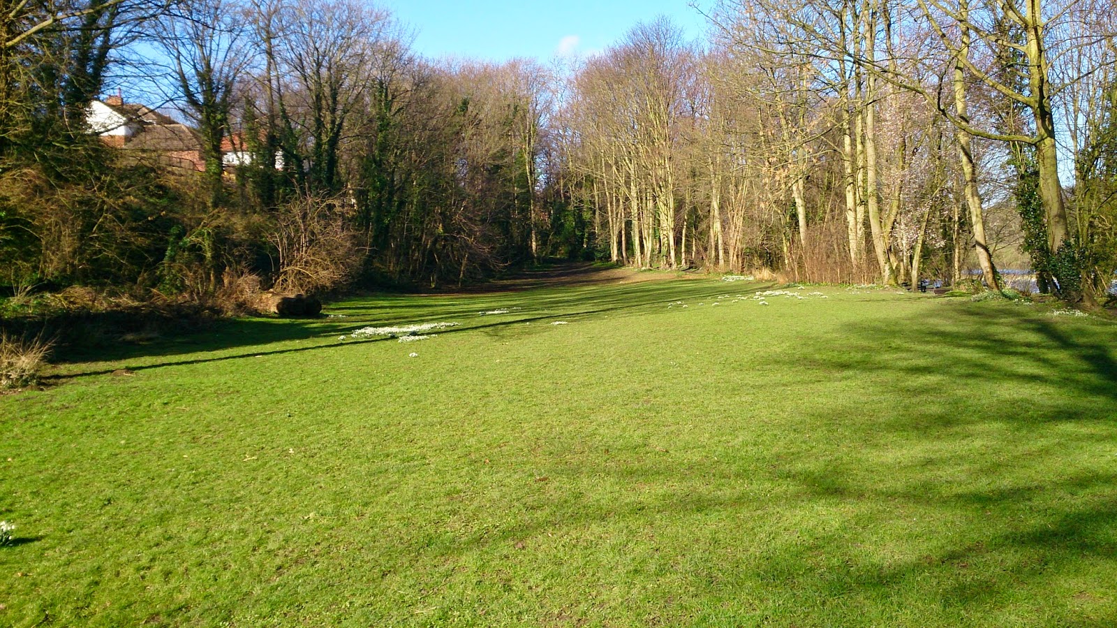
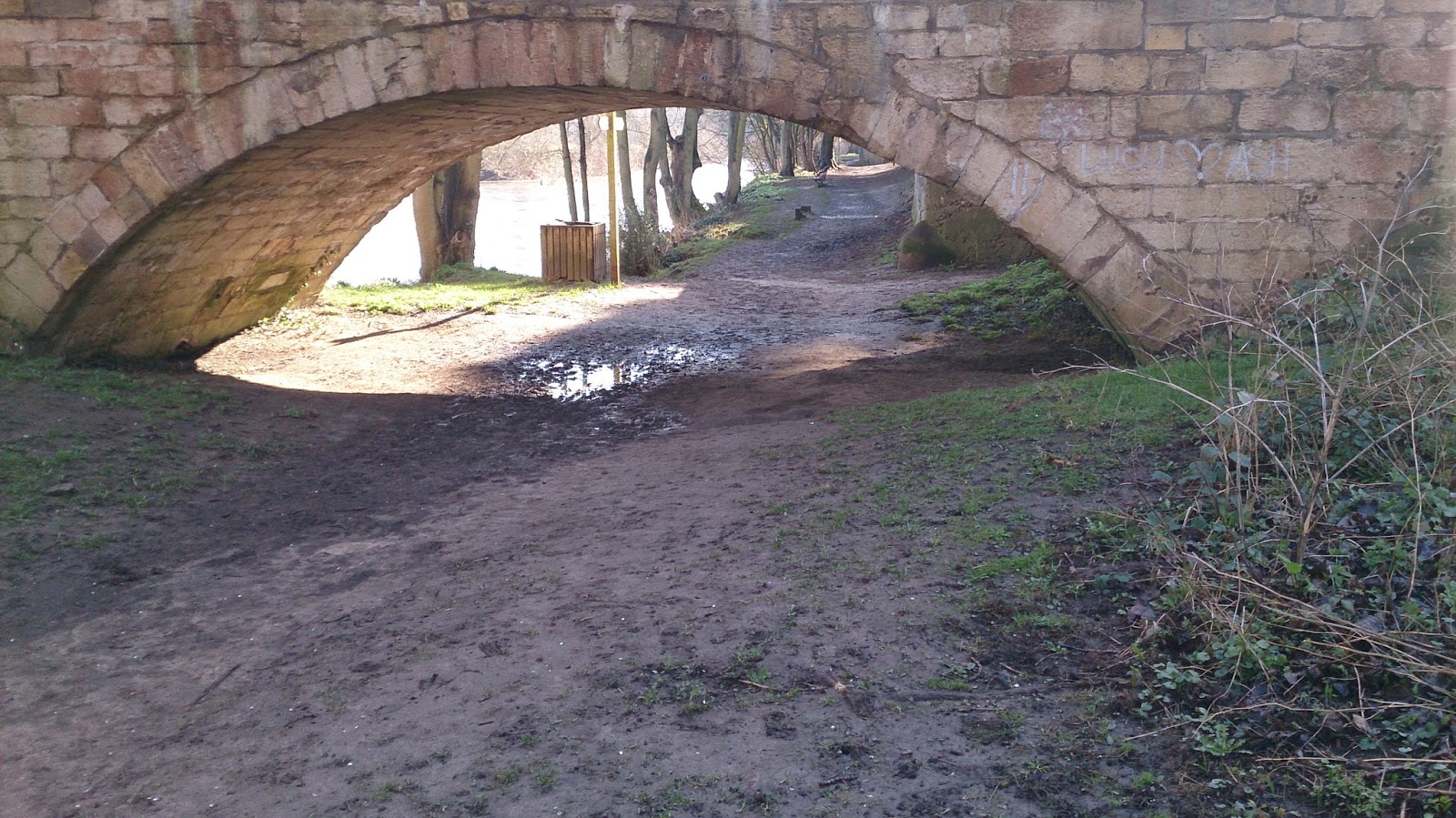
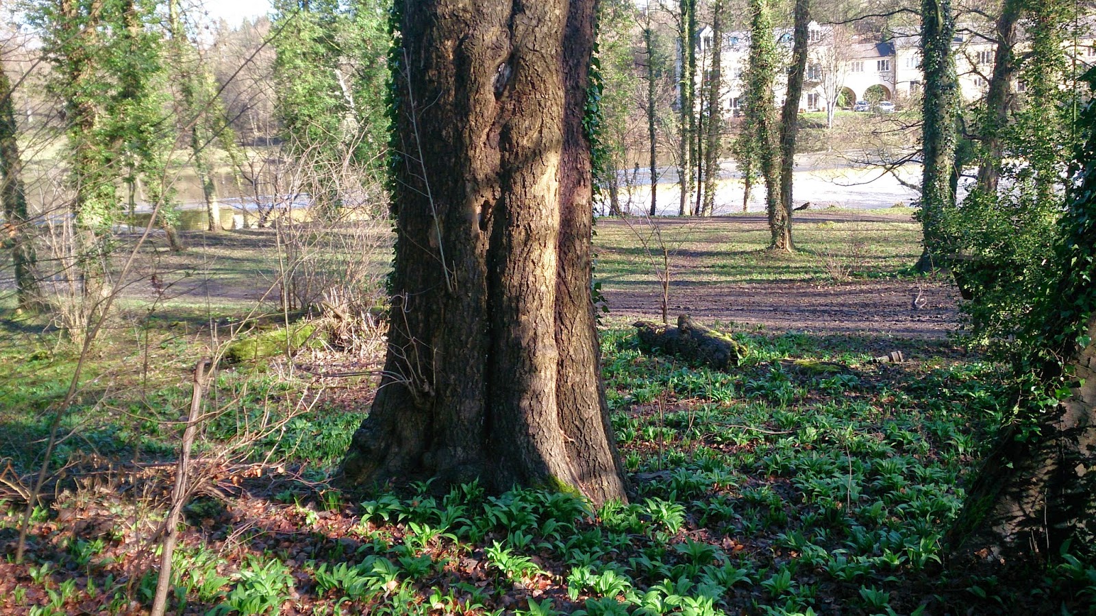
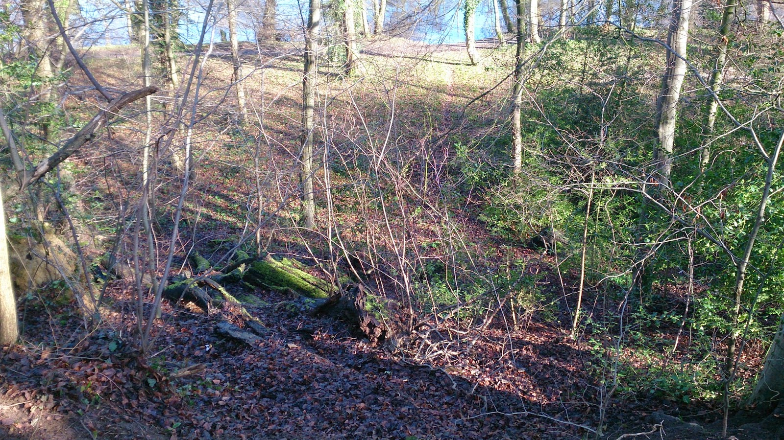
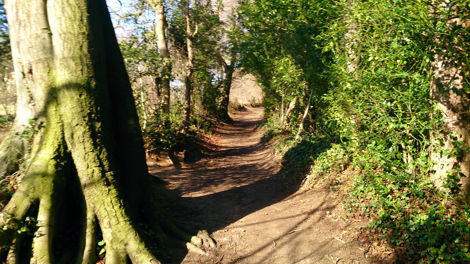
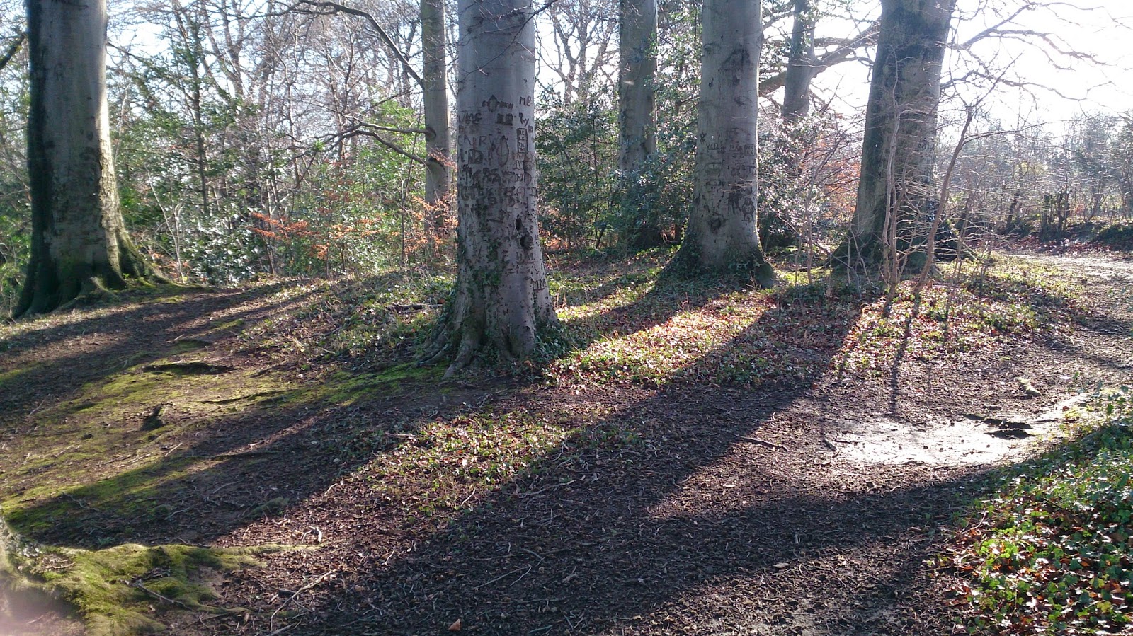
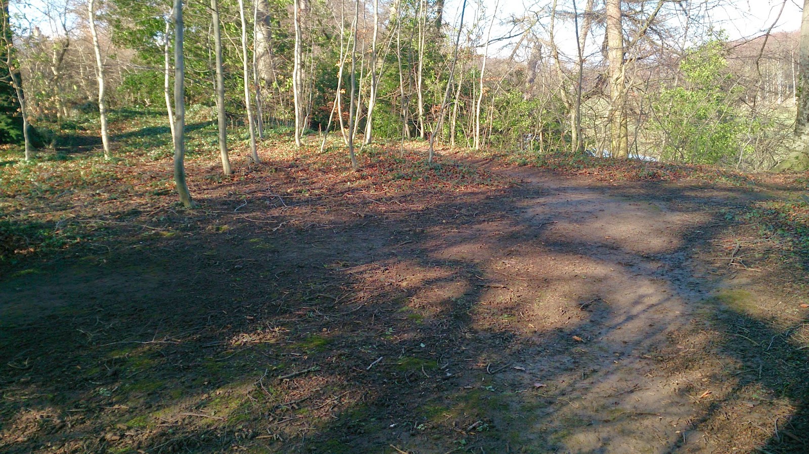
For the location, I researched the area around Boston Spa. I needed woods or forest to film the scenes. I found the right place near the town and the local river.


12/2/14
I have started to create the sketches for the film. I have alot to do and I'm not sure I have given myself enough time to do all the planning. This is because I have other projects to do.

13/2/14
I have been drawing my sketches for a few days now and I am getting behind with it. I have realised that I haven't planned this as well as I thought.

I have set up dates on my phone calendar to make sure I keep to my plans.

14/2/14
I have had to change things. My schedule is not working well because of other work. I have asked Scott if I can have more time for pre-production. This will delay my production and filming schedule. before I start to film I have asked my actors to check the location with me. This is so we can practice with the equipment, lighting and props.

19/2/14
I have changed the script. I have edited it so that there is no speaking in the film. This is because  I do not  have time to write all what I had planned. I have decided to use more body language than speech so the viewer will understand the story better.

Filming: we went to the location to practice the scenes. Then I filmed it for real. However, I had forgotten one of the props (the time machine), so I worked on different scenes.


After we had finished we went to the back of the school to the backyard to film other scenes. These scenes were the ones with the main character starting to kick the ball against the wall.

I have now filmed it. It took me longer to do because some locations had members of the public around so I had to stop filming until they had gone from the area. This delayed filming a bit. The fighting scenes took so long to prepare and practice to be ready for final filming. We got the props dirty so I had to clean them. This took extra time too. In addition,The ground was a bit wet so we had to dry the clothes. All this took an extra two hours to complete. this did not affect the natural lighting.

We also moved to a different location where there were alot of trees and not many people. This was a better place to film. I was happy with the footage.

The most difficult part of the SFX was making the tank.I worked out the location for making a motion tracker. Then I worked out lighting and the colour and the size, I need for the tank. I worked out where to place the shadow of the tank. I changed some colours on the tank to match the environment of the woods.

I used the blur tool to make tank look real.

I cannot say it is perfect because it is the first time, I have done colour and animation like this (the top of the tank moving around)


 Body of the tank


The track.


The turret body of the tank.


The turret's cannon body of the tank.


Friday, 21 March 2014

Video Art Installation Diary

Intstallation Diary 
28/02/14

I  measured the boxes I needed  to fit over the TV and camera. Some people might not able to  bend down to the box which the TV is in. I am not sure a person in a wheelchair would fit into the gap. It will depend on the length of cable and how much space I will have in the Photography room.

 I measured the space to find out how one person can fit in the space. It was 4m on horizontal and 2m on vertical.  I could not measure the actual box size because I needed to know what size the camera and TV was.
I would use 4 small arrow signs and one big  arrow.They are made of cardboard and the writing will use the black pen. The big arrow will use the tagline, 'Art'. This Way.'  The small arrow will have 'I hope you will like my Art', 'What do you think of this Art?,' Is this 'art'. 'Have you asked yourself about this art?'

I created a mood board, listing for props and equipment .

I am asking the question,' Is my work art or not?'

I had some equipment from York College:
Long cable, Camera, Socket, small TV to show the viewer viewing themselves.


The real problem is; if the small TV is not working then I hope to use one of the other small TVs.

6/03/14
I have brought the cardboard to college to create the boxes.
Media has something to cover the wires.
The TV has been tested..
I want to do more arrows for the boxes but I do not think I have time.
I will test the TV and the camera tomorrow.

7/03/14
I bring more cardboard than yesterday. I made the cardboard housing for the small TV.


I created the arrows from cardboard and stick them on the small tv's cardboard.

I am using a small Canon camera. It has fitted into the box and when I put it on extra cardboard it reached the gap so it was aimed at the viewer.

The arrows will be slotted around the TV box with messages on them. I have written a piece of information about SpY the artist I like and who influenced my ideas. I have written it with help from Jill, my support. I have also looked at quotes from famous people about art. I liked Oscar Wilde's quote about art. I want people to ask if my work is 'art'.


Thursday, 6 March 2014

Short Film Project Summary/Research

Identify the target audience I would like to address:
    The audience target is male and female. Their ages about 12 to 25 years old.
If there is no female actress or few female actress in the film then my target will be mostly male.

Appropriate content based on the target audience
    It will be 12A certificate in order to make sure younger people are not badly influenced by scenes from my film.
I study about 12A so, the action sequences and weapons may be present at 12A, and there may be long
 fight scenes or similar. The weapons which might be easily accessible to 12 year olds (such as knives),
should not be made to look good in 12A works. I think it is suitable for my film.

Back To The Future is a PG although it does have some violent scenes in the film. There are some fist-fight scenes. In addition, an unarmed character is shot several times by terrorists but there is no blood shown, although the viewers see his dead body afterwards. A man tries to rape a woman, but he is stopped by another character who punches him in the face violently. 


The Terminator: compared to my film, it had a lot of violence and brutal fighting in it. For example, 
the many police officers were shot and killed without much gore. And a man is killed by an explosion. 
We briefly see his corpse up-close, with some blood on his body. But my film will have Sci-fi weapons 
which will kill Bandit guys without bloods or gores. Some melees can be shown but not too violent. For
 example, the bad guy tried to swing at the good guy's head but he missed it. 
    My project will not have too much blood, gore, brutal fighting and swearing.
    The film will have subtitles and sign language for deaf audience.

My equipment:
Camera
Lens
3 SDs
1 battery
Light tripod
Props: Knifes, masks, homemade time machine and
Small camera (Gopro hero 2) for making behind the scene.
Laptop
Software: Photoshop, After effect and Sony Vegas pro 12.

Need equipment from York College:
Crane tripod.
Small  monitor.
Cables.
Heavy Tripod for the crane.
If York College did not meet my demand then I would follow to my B plan, I will change the plan (shot list, scripts and contingency plan.) Some of scenes which require for the crane kits will cut out.

Props:
2 black masks
2 white masks
2 green goggles
1 homemade sci-fi weapon
6 Melee weapons
1 Homemade time machine

My friends will bring their own clothes.


I decided to do this project on my own because I have good skills editing and creating special effects using After Effects. I think the subject of the film about time travel will allow me to use these skills and techniques well.

Research:
Knife Sequences:
Psycho is a 1960 American suspense horror film directed by Alfred Hitchcock. I looked at shower scene. Comprising over 70 shots, each lasting two or three seconds. I study how the killer's knife technique work.

 Close up shot, there was light behind which caused the camera see him as black. The shower was in between the killer and camera. This showed me that shot same as the actress' POV.

Med shot and level was low to show us that how powerful the killer is and how vulnerable the victim is.


V.close up shot. The scene showed the victim's body with the knife at a downward angle to show the murderer was at a higher angle. This shot did not showed us the blood come out from the body.

James Bond: Quantum Of Solace, Knife Fight Scene:


 Close up shot, the camera focus on the knife as sign of beginning danger.


The scene had 2 characters fight each other to create action / thriller atmosphere for  the viewers. James bond used the object to block or attack the knife.


The scene was med angle because this showed us that they fought on equal and 50/50 chance who'll win or lose.


Jesse  James Knife Scene:

Med shot, the killer was behind the man, this showed us that the killer was bigger and look powerful. The man look small and weak.

The med shot with high angle, the killer grabs his head and uses the knife on the man's neck. This showed the viewer that the man's life was at risk.
Although this film is rated a 15, I thought the sequence was useful for my research regarding camera angles and the position of the characters. My film will be suitable for 12 year olds to watch.

Identify the production management requirements for each idea

3 3 days for pre production
   1 days for making props
   5 days for filming
   2 days for refilming if there are mistakes.
   6 days for Post production
   2 days for finishing touches


   I had several ideas for this project. The first being, 'I Won't Do That Again - Second Time! (sequel)' but I decided that I want to make a film with new techniques so that I will learn new skills and  show off my work to film festivals and universities.

  The second idea was, 'Night School Activity', this was a horror film which was inspired by Paranormal Activity and Grave Encounter 1&2. However, I decided that this idea was not good due my lack of knowledge about lighting techniques and  I also needed to have special equipment such as night version and large lighting equipment.

  The third idea was 'Fight Game,' which was inspired by Street Fighter (Game) and Game World (my own short film). This idea used stop motion and normal frames to join in one film. I thought this idea was really good, however, I could tell that it might bit too long to make it in post-production than the other projects

 Appropriate production techniques
  http://www.youtube.com/watch?v=W4r5Mvlukhk
How to Shoot a Fight Scene:
I study about elements; continuity, camera techniques and editing. When these elements are all combined then the end result will a very intense and very emotive and realistic piece of video making that will take your viewers and kick them right in the face. The continuity is very important because when it comes to shooting any action sequences, for example, you have to follow the invisible 180 degree line of what our eyes see, otherwise, we will end up with a scene that does not flow correctly or seems jarring and results in a jump cut.

Identify potential constraints on production:
I might need more time to make a film after half term because  2 weeks for filming block may not be enough.
The location may not be available or practical on the day (e.g. bad weather)
The filming may be delayed because the actors are not prepared.
Lack of preparation for the action shots.
I might need more female actresses.
There might be a delay getting equipment (Crane tripod) from York College.

Mind maps:

Identify ways to address constraints:
 Ask Tutor for permission to make a film for one extra week
 I need to rehearse dialogue and fight scenes to get the flow of action smooth. .
 Make an appointment to see the female actresses
 Change the shot plans.
  Make a schedule to fit into the filming time limits.


Identify the range of resources and materials available to me (audit)
My friends will take the roles as actors.
I take all the crews/technical roles
They will help me to carry the equipment.

Undertake research into appropriate production techniques
Destiny - Animation Short film ‘Repeat time style’ I study it about how they used this effect (Repeat time) in this film.  They did it with 3D software.
However for me, this requires After Effect and video editing software to do it. I would use After Effect to clone the actors and mask them.  The video editing software cut it to next shot for focusing on the main character.
http://www.youtube.com/watch?v=wEKLEeY_WeQ


Rewind Short Film ‘Rewind style’ I could tell that they used video editing software to make the footage backward in normal speed.
I have to use the camera technique ‘Long movement’ for example when I use the ‘Rewind’ and then the scene would backward slowly and with long take.
http://www.youtube.com/watch?v=PyXNze_7ki8


Time freeze effect ‘Pause style’
They use camera stabilizer to make the camera movement smooth. The actors/actress act a like statue to trick the viewers thinking it's freeze time.
http://www.youtube.com/watch?v=HuJw3g1eCu8

Back to the future ‘Forward and backward time style’

Looper ‘loop time style’

Kill Bill Vol.1 Fight Scene
https://vimeo.com/23363723

I asked my male friends about Kill bills' action, they gave me the feedback. They don't mind if female or  male actors fight each other. My female friends want the female actors appeal more than male. However, for my project, the male actor will appeal more because most of my female friends don't have a time to actor. They don't like the camera shaking too much but to my film project, I would make it less camera shaking. They were impressed by the fighting techniques. But my film project, there will less fighting techniques.

j


Friday, 24 January 2014

Unit 35 Research

Unit 35 Research
Artists first experimented with video art in the 1960s when video art first appeared. Video art relies on video and/ or sound to make new medium. In the 1990s, digital technology joined together with the video process, independent film-making and photography.

Nam June Paik is thought to be the founder of video art. He had his first exhibition with manipulated TV in 1963 at the Gallery Parnass in Wuppertal.


Over time, Nam June Paik worked with the Neo-Dada art movement, known as Fluxus, the artists were inspired by the composer John Cage who used everyday sounds and noises in his music. He showed his work at an exhibition known as Exposition of Music-Electronic Television where he scattered televisions everywhere and used magnets to alter or distort their images.
Paik was known for making robots out of television sets. These were made using pieces of wire and metal, but later Paik used parts from radio and television sets.
Nam June Paik, 'Robot K-456' and Charlotte Moorman (1964). Photo by Peter Moore @ Estate of Peter Moore/VAGA.NY
Nam June Paik, 'Robot K-456' and Charlotte Moorman (1964).
http://www.paikstudios.com/#top

Electronic Superhighway: Continental U.S., Alaska, Hawaii
fifty-one channel video installation (including one closed-circuit television feed), custom electronics, neon lighting, steel and wood; color, soundapprox. 15 x 40 x 4 ft.Paik siad that, 'The different colors remind us that individual states still have distinct identities and cultures, even in today's information age." He meant that each American state had its own history, values and diversity so he shows this with the individual shapes and colours.

Megatron/Matrix: here he created aneight-channel video installation with custom electronics; color, soundapprox. 132 x 396 x 48 in. (335.3 x 1005.8 x 121.9 cm)Paik said, '... our bodies are our primal connection to the world, but the effect on the viewer is of being assaulted by "too much information.' The 215 TV screens show different mixes images from the Seoul Olympics with Korean folk rituals and modern dance. Smaller clips play at the same time on multiple monitors, while larger, animated images flow across the boundaries between screens, suggesting a world without borders in the electronic age.


A modern video artist I am interested in is Michael Betancourt. He is a critical theorist, film theorist, art and film historian, and animator. He looks at the technologies of visual music, new media art and theory, and motion pictures.
 He has used old film footage with modern footage to create his video artwork.
http://av.vimeo.com/34521/441/136531114.mp4?token2=1390386989_e6abe2f72d9285a9905ae914e1cd3ea1&aksessionid=05c94bb07336b29f&ns=4


she, my memory (2002)

Michael Betancourt made this in 2002, he used his editing software to render high quality footage into very low quality footage. He used small footage because low quality footage are 240p resolution. If he made them extend to fit in 4:6 screen then there will huge pixel with a blur.  

David Finkelstein, 'Film Threat' said '... an image of the woman he is seeking is caught and frozen within the rushing motion, and gradually blown up until the pixelization of the image makes it unrecognizable. This film uses a spare and powerful visual language to depict the unease that our memories can cause us..." about she, my memory.'


File:Kodak Moment (2013) sample animation.gif


The Kodak Moment (2013)

https://vimeo.com/73802758: Michael Betancourt
The silent film actress Mae Murray, known as the “girl with bee-stung lips,” is shown in fancy dress, flirting with the audience. She is an early 20th Century Hollywood film star with her white face and red lips, a form that was already old when the source film was shot in 1922.  Here Betancourt has glitched and fragmented her movement. but she is still recognizable throughout this movie. The music is from an old 1920 recording of piano soloist Mary Hallock-Greenewalt playing Chopin’s Nocturne in G Major.
Glitch is used to describe these kinds of bugs as they happen in software, video games, images, videos, audio, and other forms of data. 


Contact Light (2012)

Michael Betancourt


Contact Light explores the idea of the 'man in the moon' through glitches, optical illusions and the Apollo 11 and 17 missions in 1969 and 1972, designed by Michael Betancourt.

In Georges Melies' 1902 film "A Trip to the Moon," the astronomers are dressed as wizards, not scientists, putting the journey they make into fantasy-- seventy years later humans actually go to the moon.. It is possible to have seen Melies' film when it was new and to watched the 1969 moon landing as an adult. He has linked them together to make a juxtaposition of  old fantasy ideas of the moon and visiting it in reality that gave rise to this film.

The Process of Eupraxis in Making Dancing Glitch (2013):
http://www.othercinema.com/otherzine/the-process-of-eupraxis-in-making-dancing-glitch-2013/
Dancing Glitch is a 2.5 minute long movie that is based around footage from the Louis Lumière film Danse serpentine, vue no. 67, then dancer/choreographer is Loïe Fuller, filmed in 1896. Betancourt liked early 20th Century artwork. The clip was hand coloured and the colour was animated. He compressed the digital file but kept some of the detail. Betancourt made this short film as the starting point for his exploration of how digital movies change to abstract art when experimenting with glitching to give extra layers to the result.


Jennifer Steinkamp
This artist is from Los Angeles, explores ideas about architectural space, motion using computer animation to engage viewers through use of transient elements in the natural world. Her work has been called ‘a darker view of nature thoroughly manipulated by man’. (Xandra Eden, University of North Carolina)


Our image this month is a still from a video, exhibited earlier this year at Greengrassi gallery London, which continues Jennifer Steinkamp says other artists who have influenced her are Turrell, Dutch painters, and Jackson Pollock. She begins planning each piece by visiting the site where it is going to be installed. She researches the context and history of the place and then creates a three-dimensional model to see how the projection will look. She describes the actual creation of the images as a combination of painting, sculpture and photography using computer paint programs and LED lights. This piece was made for the Hammer Gala 2007 honoring Mike Kelley, who was one of her favorite teachers. This piece is part of a series work in which she pays respect to her past teachers with trees dedicated to them.


this artist from Madrid calls himself SpY. he Installed the cameras with the “intention of not watching over anything,” SpY’s new intervention in Madrid features 150 fake surveillance cameras on the side of a building. The Spanish street artist is known for his appropriation of urban elements to make his message known and this newest Cameras piece is no exception.

Above artists were inspiration to me, they give me an idea: 'Spying' NSA , glitching and using light to create a pathway of exploration. SpY's ideas have influenced me to use CCTV cameras to film peoples' reactions to being watched. 

Friday, 17 January 2014

Stop Motion Ident Assignment evaluation

Evaluation for E4
I was given assignment 'Stop Motion in TV' by my tutor.

I chose the room at my boarding school because it is a modern room and had alot of space to film in.  E4 appeals to a young audience who love going out, sleepovers, being sociable and spending their time on heavy internet use like Facebook or YouTube. 
This room style will look like the early digital era. The couch will change colour randomly. The stop motion (Logo of E4) objects will fly out of the smart phones, laptops, computer, iPad tablet and window. The background will change into light purple. 
I will use the After Effect’s tool called Flare Light to make the ident look more like it is in the digital era. 

The camera movement will be done by using the dolly in each scene.
After Effect for changing the objects’ colour into purple. Use the Animation tool to make the objects moving. Photoshop to create the logo of E4. 
Sony Vegas Pro for editing the clips.
3D Camera tracker (After Effect tool)  (Matchmoving) can scan every the camera movement and then to create the tracker’s map for After Effect.

To gather my research I created a questionnaire using Survey Monkey and the responses from my class.and outsiders.


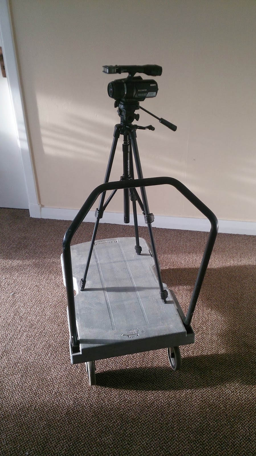
This is homemade dolly. 

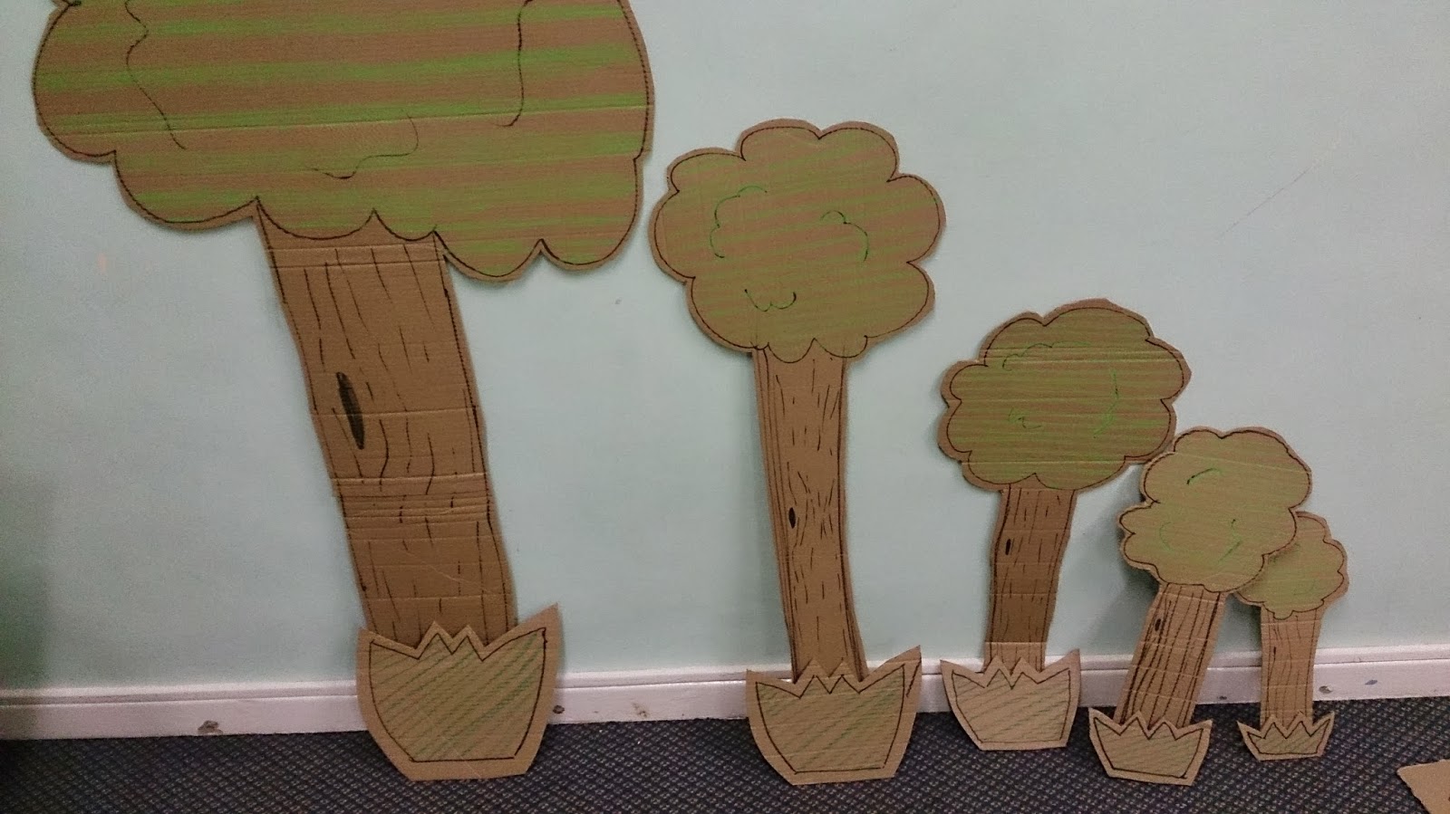
I used the cutting board, the knife and black pen to make the cardboard animation.
 Some of them were colours by using the oild pastels.
I cut them out by each frames.  
 
 This is brainstorming map which can help me to get idea.

After creating the brainstorming, I got an idea to create the shark.
I made the shark jump and eat the E4 logo. I thought it would be entertaining for the young and also the older viewers would find them amusing. 

Feedback
The feedback from the class was very positive. On the whole, they thought that the technical part of the ident was professional and good quality. One commented that the animation was "smooth and jerky" but that it made a good effect also, I had two positive comments about the lighting effects on the TV and phone. 

For the soundtrack the responses were positive and professional.

The comment about the creativity of the ident were, "smooth animation using a range of skills". Also, "a good use of the iconic E4 purple"

However, I had some comments that I did not really use Stop Motion.  I agree, I did create the animations digitally but feel that I agree with some of comments. However, I did not agree with the comment about the work being digital because I asked the tutor beforehand and it was agreed that I could use digitally stop motion format.

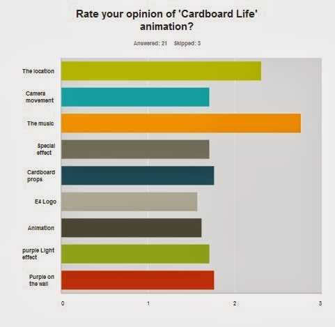
From the Survey Monkey I had 24 responses; 60% were female and 40% were male. The age range was between 18 years and 64 years old.


Figure 1
"It is lively and contemporary is style. The cardboard shapes suggest a variety of programmes. The whimsical nature of the animations is interesting, and intriguing." and "It tells me of something that I'm trying to find out, I assume it's do with children in adventure!" I think they were very close what my target. Next time, I would research about real E4 ident bit more. And then remodel the cardboard to make them appeal to the older audience. 

Figure 2
This asked the suitability of the music to suit the animation and the E4 audience type. It was felt that it was 'cheesy' and did not  have enough 'upbeats' to the track. i agree with this because I realise that the music was not suitable for a younger audience. It was the older age group who thought it was not suitable. However, the Ident is aimed at the younger audience who did not have any negative comments.


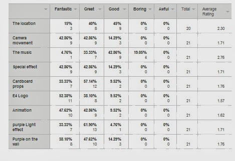
Figure 3 
Some people think the music is good (42%) however, some of them think it is boring (19%). this could link with the comments about it being too 'cheesy' and needing to be more 'upbeat'. The track could be more up to date and modern. I could have researched popular music which young people listen to.
the E4 logo received over 50% 'Fantasic' comments. I am pleased with the final production of it but I would improve the SFX like the comment said "Just as an example; when your rocket flies across the screen at about 0.13, you could add a shadow to the wall to add some more realism to the animations. Think of how the light would cast the shadow in the room if it was really there."  I will research about shadow, on the small stage with lighting. i could also take some photos of objects to study the shadow positions

I think this is good advice for the next time I do stop motion work.
"This is for most filmmakers one of the golden rules. Instead of zooming in, track forward. Going on your tracks sideways you've either got a dolly or a very steady hand (if its the steady hand lucky you!), both will have better effect than a zoom in this case."

Next time I will improve the camera dolly, remodeling the cardboard and pick the better location which have big space for the camera to film.  I would change the props to look more modern, when I find the modern props then I will relocate it into the living room.